home | links | contact

art by suzette chanjournalism by suzette chanradio hosted by suzette chanweb design by suzette chan

suzette chan > art > visual design I > final project: texture


General
Various projects

Class Work
Drawing I
Flash
Typography
User Interface Design
Visual Design I
Visual Design II
Visual Design III
Visual Design IV


final project (texture)

contrast | shape | final project

We were asked to plan or create three compositions emphasizing the design element of texture. The one which worked the best was in the form of a shadowbox. I was interested in the ways we conceptualize and experience texture: by touch, by sight and by language. I attempted to emphasize these ways of gathering sensory clues by taking them away from the viewer.

Because they are behind glass, the textures cannot be experienced by touch. Because the impressions I took of everyday objects includes weird extrusions and twists, they are not recognizable by sight. And because the names of the objects are written in Latin (a nod to the butterfly collections associated with shadowboxes), most people cannot rely on the crutch of language to identify the objects.

Strange textures of everyday things are pressed into plastic modeling clay, labeled in Latin and presented behind glass in a shadowbox.

T Phillips advised me on the use of modeling materials and Cora Buhlert did a fantastic job of translating the English names of these objects in to Latin. In case you're wondering:
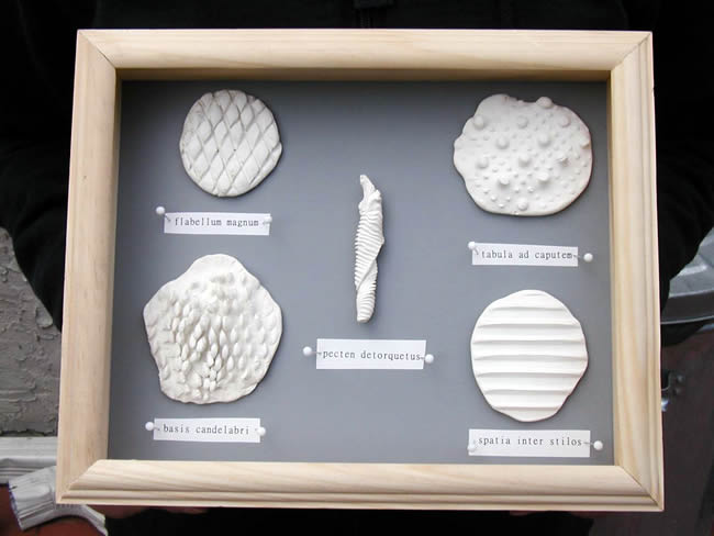
flabellum magnum = big fan
this was taken from the wire casing of a household oscillating fan

pectin detorquetus = twisted comb
I accidentally twisted the very first Sculpey impression I made, but I liked the effect

tabula ad caputem = headboard
this is from an old (1930s?) bed I bought at a yard sale; the bed is also depicted here

basis candelabri = base of candleholder
steel sculpture and steel decorations are very popular locally; this is from a candleholder that looks like a flying space craft — I'll have to do a stetch of it someday!

spacia inter stilos = spaces between pencils
I pressed some Sculpey onto a set of drawing pencils in their tin crib; if you get close enough, you can see the brand and grade of the pencils


back to top


suzette chan | art | journalism | radio | web

back to top | home | links | contact